James F. and Marion L. Miller Foundation
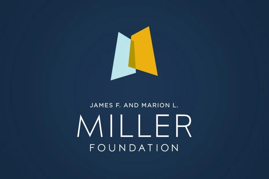
The Miller Foundation’s new logo and brand identity reflects its vision and purpose.
DISCOVERY
Sheepscot conducted extensive one-on-one interviews with stakeholders around Oregon, surveyed hundreds of arts and education professionals, and conducted industry-wide research to better understand and articulate the James F. and Marion L. Miller Foundation’s mission and reputation. That discovery work informed a full brand makeover and communication strategy for one of the state's most respected foundations.
THE NEW LOGO
Sheepscot designed a logo that encapsulates and represents the vision, purpose and leadership of the James F. and Marion L. Miller Foundation and the legacy of James Miller.
The two overlapping, asymmetric polygons represent the dual interests of the Miller Foundation: arts and education. Multiple metaphors inform the composition of the gestural mark: lighting on a stage, an open book, and a highly stylized M initial.
The colors used in the logo are inspired by an abstract expressionist palette and achieve a balance of being unexpected yet enduring.
The name of the foundation is set in a customized geometric sans serif and establishes Miller as stable and substantive but unobtrusive.


