Oregon Jewish Community Foundation
Brand Refresh RFP
H. Previous Work Product
Sheepscot Creative
James F. and Marion L. Miller Foundation
Logo and Brand
Background
At the start of our work with the Miller Foundation, we conducted extensive one-on-one interviews with stakeholders around Oregon, surveyed hundreds of arts and education professionals, and conducted industry-wide research to better understand and articulate Miller’s mission and reputation. That discovery work informed a full brand makeover and communication strategy for one of the state’s most respected foundations.
Design
Sheepscot designed a logo that encapsulates and represents the vision, purpose and leadership of the James F. and Marion L. Miller Foundation and the legacy of James Miller.
The two overlapping, asymmetric polygons represent the dual interests of the Miller Foundation: arts and education. Multiple metaphors inform the composition of the gestural mark: lighting on a stage, an open book, and a highly stylized M initial.
The colors used in the logo are inspired by an abstract expressionist palette and achieve a balance of being unexpected yet enduring.
The name of the foundation is set in a customized geometric sans serif and establishes Miller as stable and substantive but unobtrusive.


Deliverables
Redwood Foundation for Education
Rename and Rebrand
Description
The Redwood Foundation for Education was founded in 1964 as the Josephine County Educational Fund (JCEF).
By 2021, after nearly sixty years in operation, the foundation’s leadership had reached a consensus about the need for a new name that more accurately reflected its work. After decades of growth, the original name misled both students and potential donors about the geography JCEF served (which includes parts of Jackson and Douglas Counties) and the structure of its financial operations (it’s not a single fund but rather a foundation comprised of many funds). Those shortcomings limited JCEF’s ability to attract donors, scholarship recipients, and potential partners. And though the foundation had grown in capacity to award almost a million dollars in scholarships each year, they lacked the branding and print collateral to represent work at this new scale.
The foundation needed to create brand awareness within the region, build trust among new and existing stakeholders, and convey their investment in the region at large. And they needed higher caliber print and digital tools to communicate in a consistent, professional manner.
In developing a new name for JCEF, Sheepscot focused on the foundation’s core character traits as identified by key stakeholders: stability, longevity, trust, and a sense of place rooted in Southern Oregon. Top-of-mind for us throughout this process was the need to avoid any name that would recreate the problem they aimed to overcome; the new name shouldn’t inhibit any potential for future growth.
Eventually, we landed on Redwood Foundation for Education. Not only does the Redwood Highway terminate in Grants Pass, Oregon, where the foundation is headquartered, but redwoods truly evoke the sturdy, lasting, authoritative characteristics the foundation strives to embody.
With the name in place, we began developing initial logo designs. We quickly moved away from more traditional depictions of redwood trees or cones—because the foundation’s focus is education, not the environment—and landed upon a “looking up” design, which captured the feeling of staring up into the canopy of a forest. It was unconventional, aspirational and eye-catching.
Once the logo was finalized, we developed a palette of natural, earthy colors to capture the vitality and strength of the new brand.


Renaming
Logo
Deliverables
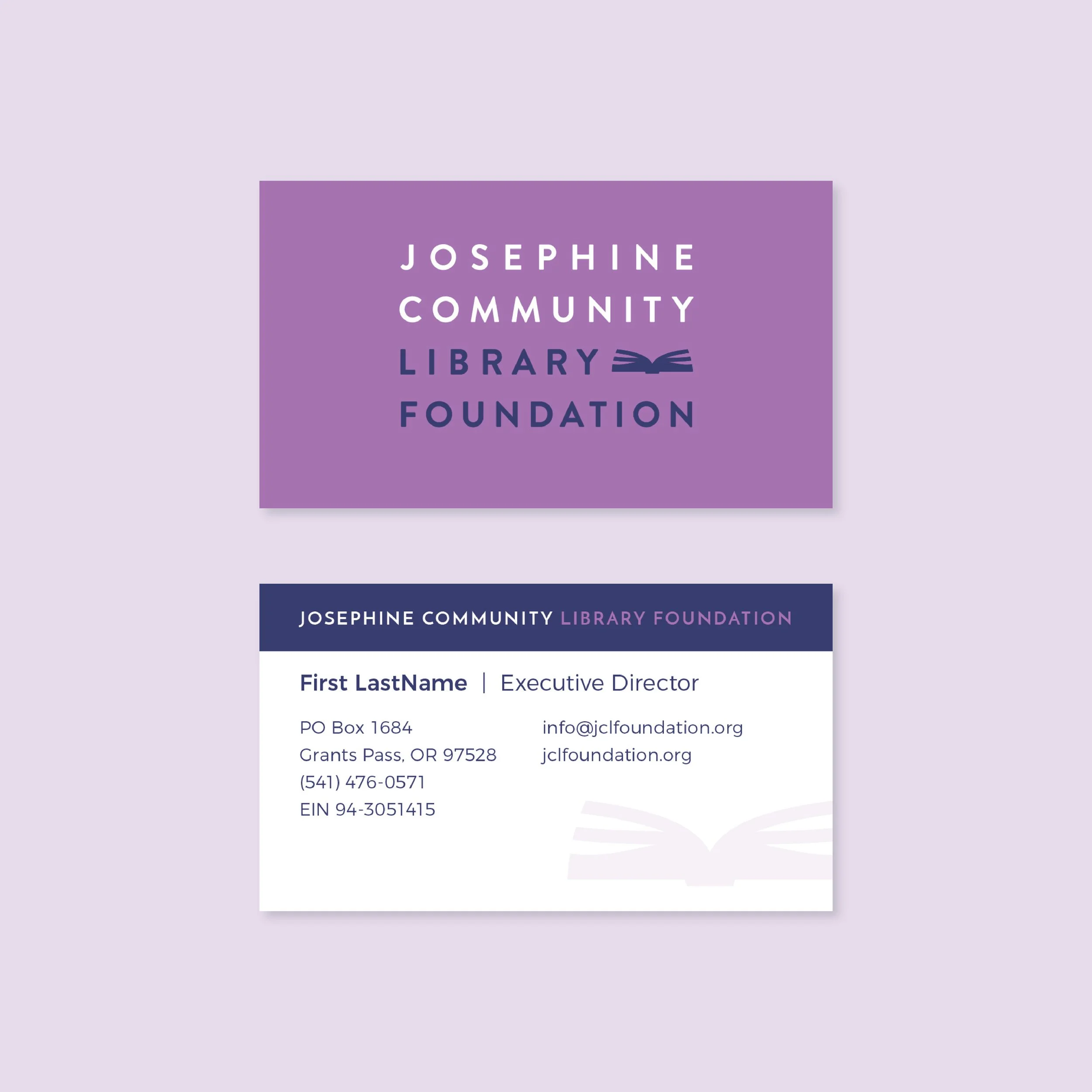
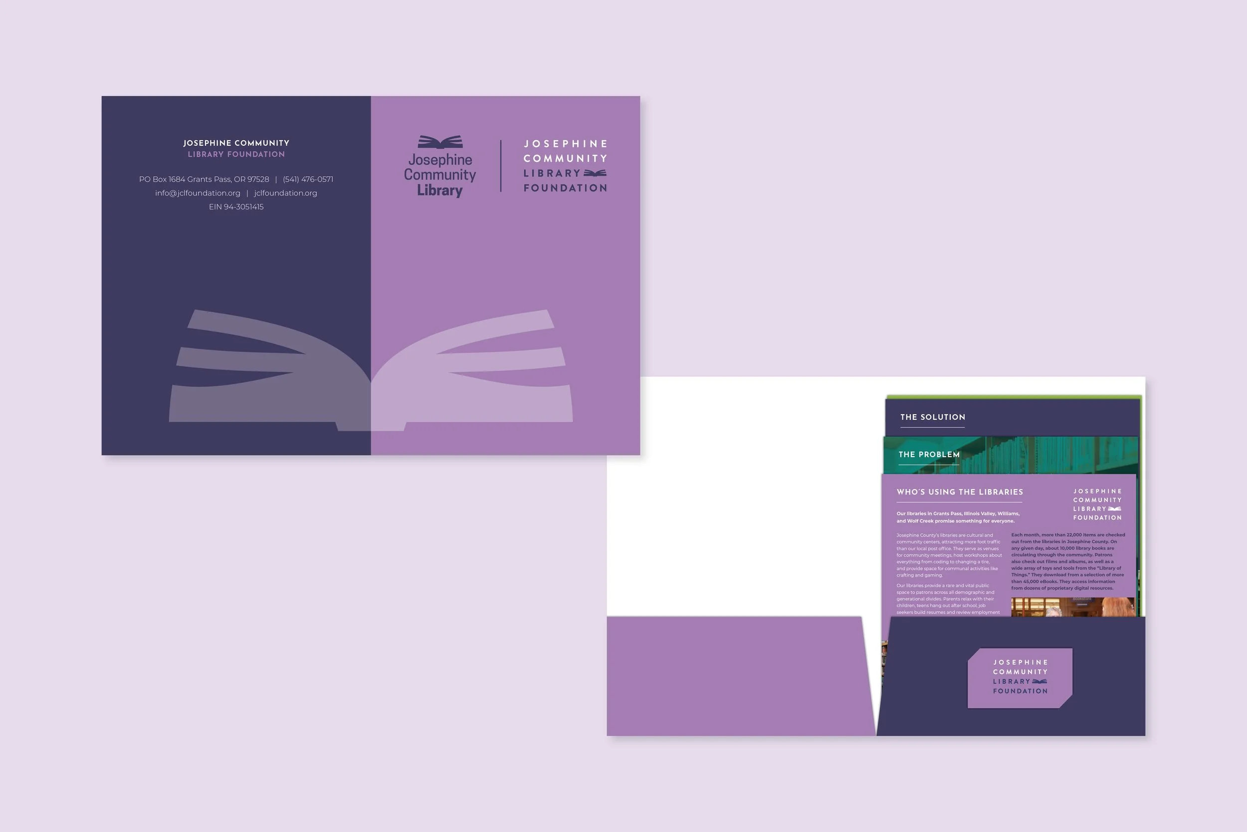
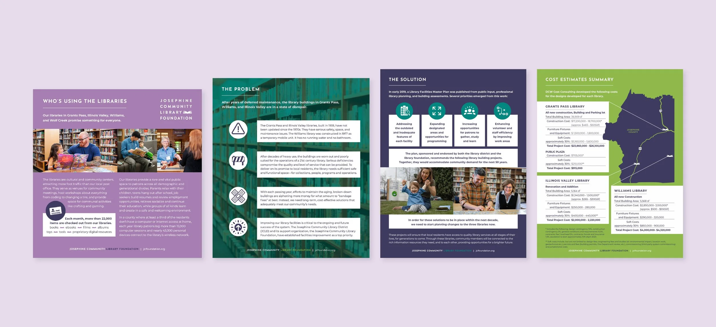
Josephine Community Library Foundation
Rename and Rebrand
Description
When Josephine County voted to fund a Library District in 2017, the library foundation assumed new responsibilities as the primary fundraiser for vital capital projects. They called on Sheepscot to create a brand that shows they’re up to the challenge.
Five months later, the foundation launched under a new name with a new logo, website, print collaterals and brand guide.
In March 2019, Sheepscot visited the Grants Pass branch of Josephine Community Library for two days of stakeholder interviews with donors, board members, library staff and patrons.
We proposed updating the name from Josephine County Library Foundation to Josephine Community Library Foundation. Stakeholders rallied around the change.
The foundation logo echoes the book iconography of the district’s and shares a complementary set of colors. Its sturdy lettering and layout conveys reliability and professionalism but remains as friendly and approachable as the library itself. Stakeholders rallied around the change.
Renaming
Logo
Deliverables
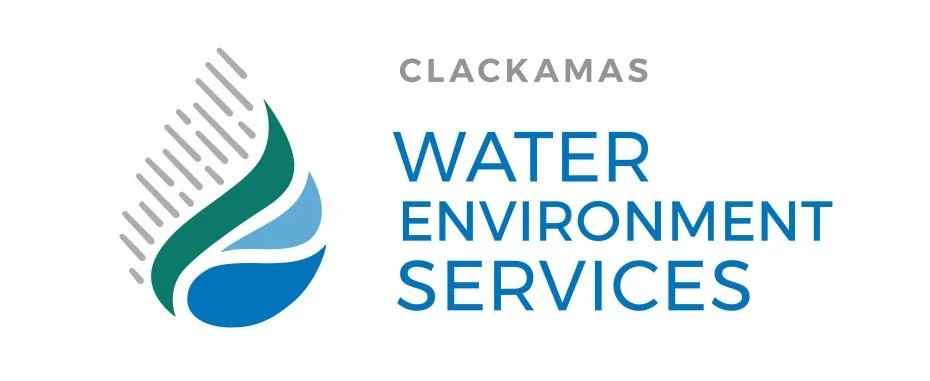
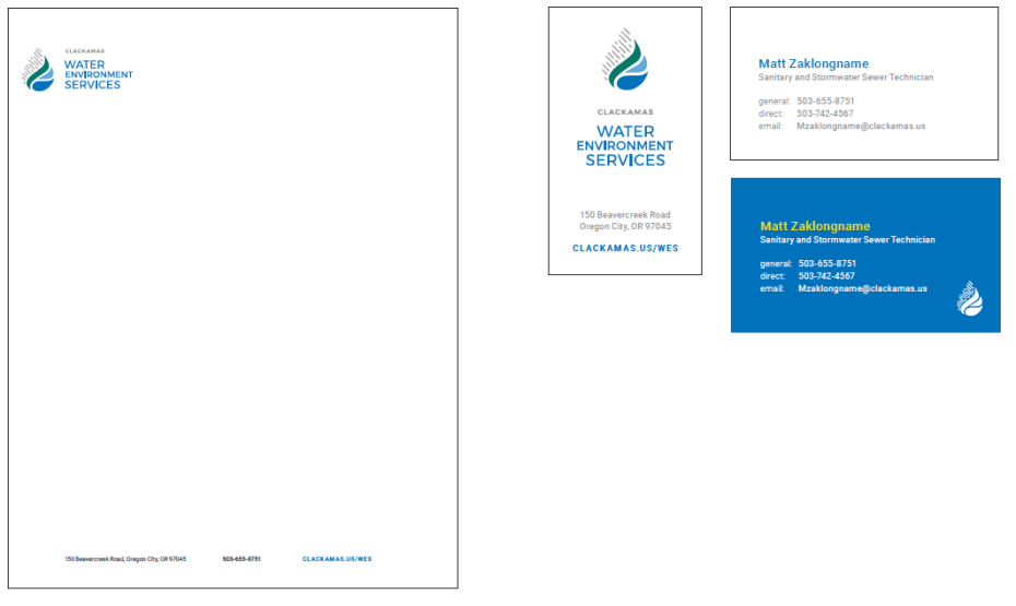
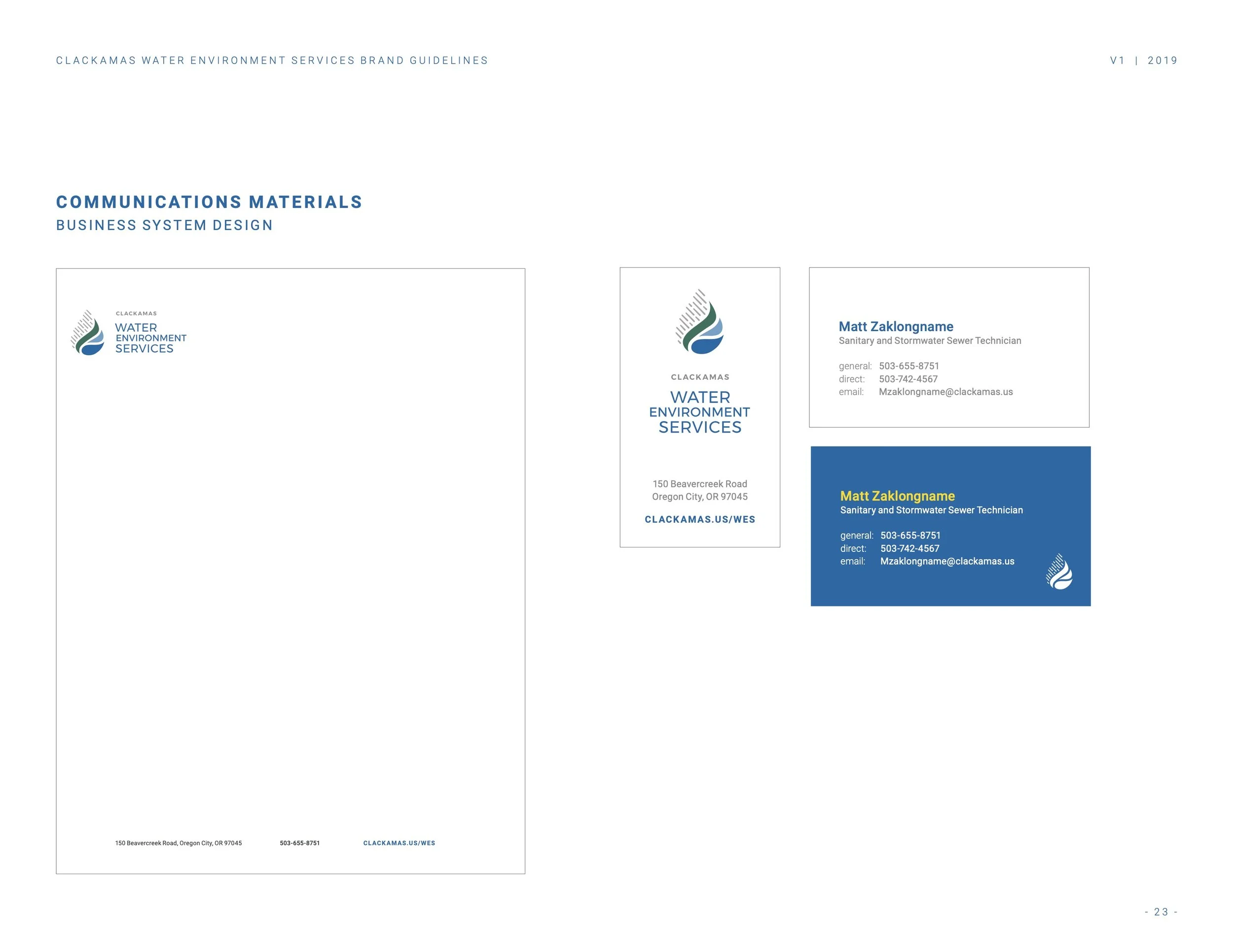
Clackamas Water Environment Services
Logo and Brand
Background
After the consolidation of sewer and surface water districts, Clackamas Water Environment Services saw a chance to unify around the mission that drove both agencies: to protect public health, the environment and the region’s economic vitality. They called on Sheepscot to design a new logo and brand, and to deliver strategies, tools and templates for them to launch and run the brand.
A highly collaborative, six-month process started with three brand workshops (nearly seventy percent of employees participated) and an online survey distributed company-wide.
A Brand Advisory Team was created. Members represented each of the organization’s locations and departments. They met regularly and provided ongoing input and direction, while serving as liaisons with the staff at large.
Employees raved about Clackamas County's natural beauty; they marveled at all the world-class outdoor opportunities nearby. And they conveyed a deeply held commitment to protect their community's health, not to mention the quality of life that this landscape and climate provides.
Description
Facilitating better understanding of the utility’s work and impact among ratepayers, voters and elected officials was a core objective of our work. The brand also needed to fit within Clackamas County’s already-existing graphic framework.
Along with the logo, Sheepscot produced guidelines that will help agency and county staff maintain brand continuity years into the future.
Deliverables